ABOUT

Shorthead Brewing is a new Yakima Valley brewery. We made a complete brand identity for SHB. The stone-like hop was heavily influenced by the owner’s profession of rock crushing while the name “Shorthead” comes from a very important piece of the process.

ICON

The hop portion was made to represent a stone, which ties back to the clients’ rock crushing background. The colors were taken from stones and their environment.

TYPOGRAPHY

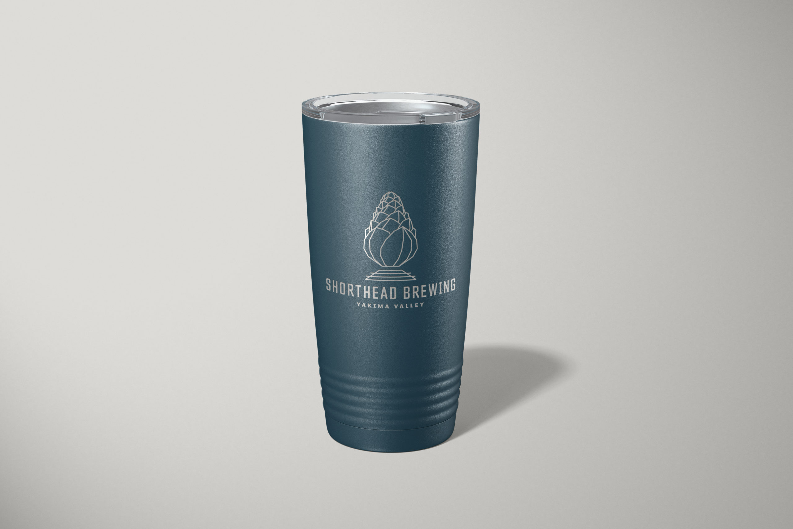
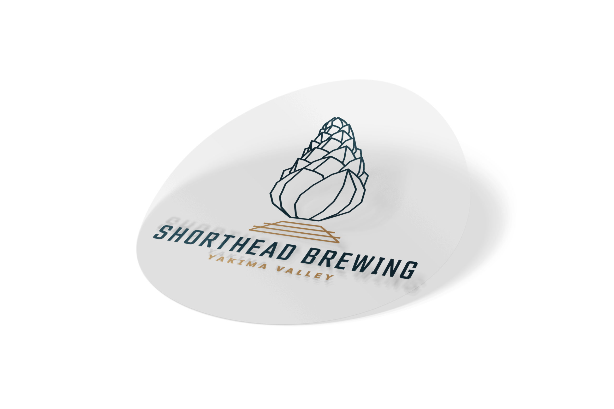
The typeface had to be just as strong as the stone hop. We chose Counchtach because of its square, sharp, and hard edges to be powerful enough to stand alone. We chose to incorporate the Yakima Valley instead of just the city of Yakima because hops and beer are a crucial part of what this valley has to offer.

COLOR VARIATIONS
BRAND ASSETS